Exploring the Latent Space of Aurora’s Encoder
In a previous post, I introduced Microsoft’s Aurora model, outlining its architecture and the motivations behind its design.
In this post, we’ll take a closer look inside the latent space of the model’s encoder to examine what kinds of representations it has learned. The role of the encoder is to compress inputs into an embedded representation, while the processor component is responsible for modeling temporal dynamics. Because of this division of labor, we should not expect the encoder to capture explicit information about physical processes or time evolution. Instead, we might uncover structural distinctions present in the raw input data itself.
Specifically, this analysis will focus on whether the latent space encodes a clear separation between land and ocean. If such a distinction emerges, it would suggest that the encoder is capturing meaningful features tied to the geography of the input fields, an encouraging sign that the model is developing representations aligned with real-world structure. If not, it may point to limitations in the encoder’s ability to disentangle different components of the input space.
The full code for this post can be found here.
What is the Latent Space?
The latent space is a compressed, numerical representation (often a high-dimensional vector) produced by the encoder from raw inputs such as global temperature fields, wind patterns, or precipitation maps. It acts as a bottleneck layer where the model distills the most important spatial and statistical features of the atmosphere and surface conditions into a compact form.
Exploring this space helps reveal how the model internally organises weather information. By probing the latent space, we can better understand not just what the model predicts, but how it represents the underlying weather features it relies on.
The Encoder Ouput
The encoder’s output is a matrix of size $512\times 259,200$. To interpret it, it will be fruitful to understand how it was constructed.
Surface and atomspheric variables are passed separately to the Aurora encoder, and are treated independently before being combined in the output.
Surface and static inputs are first combined into a tensor of size $2\times 7 \times720\times 1440$ (two time steps, seven variables, global grid). With a patch size of 4 and embedding dimension of 512, the surface encoder produces $512\times 180\times 360$, which is then flattened to $512\times 64800\times 1$.
Atmospheric inputs start as $2\times 5\times 13\times 720\times 1440$ (two time steps, five variables, 13 pressure levels). Using the same patching scheme, this becomes $512\times 64800\times 3$.
Stacking surface and atmospheric embeddings yields $512\times 64800 \times4$, which is flattened again to the final $512\times 259200$. Each column is an embedded vector representing either a surface patch or an atmospheric patch at a given level. Together, they cover the full globe.
This structure is important because later we’ll want to map vectors back to their original patches—for example, to test whether the latent space separates land from ocean or different atmospheric regimes.
The first thing we will want to do is to set up the Aurora model and get access to the ERA5 data, which we will pass to the encoder to obtain the embedding. It will also be helpful later on to calculate the centre latitude/longitude position of each patch.
To generate these embeddings, we pass the input fields directly through Aurora’s encoder.
import numpy as np
import xarray as xr
import torch

# Load model
device = torch.device('cuda' if torch.cuda.is_available() else 'cpu')
aurora_model = get_aurora_model(device)

# Set data paths and read data
drive_path = "drive//MyDrive//Weather Models"
static = temp = xr.open_dataset(f"{drive_path}//aurora/static.nc")

era5_path = "https://storage.googleapis.com/weatherbench2/datasets/era5/"
era5_file = f"{era5_path}1959-2023_01_10-wb13-6h-1440x721_with_derived_variables.zarr"

era5_ds = xr.open_zarr(era5_file)

# Patch and lon/lat variables
patch_size = 4
patch_center_lat, patch_center_lon = reduce_lon_lat(patch_size, era5_ds.latitude.values[:-1], era5_ds.longitude.values)
Ocean and Land
Next, we test whether the encoder has learned to distinguish ocean from land. During training, Aurora receives a land–sea mask as input, so it’s reasonable to expect this distinction to appear in the latent space. Importantly, this separation matters physically as land and ocean respond differently to forcing, so learning this boundary is consistent with the underlying dynamics. However, there is no guarantee that it has learnt this boundary.
Our analysis uses two approaches: principal component analysis (PCA) for visualisation, and logistic regression with the land–sea mask as labels to quantify separability.
To prepare the labels, we start from Aurora’s static land–sea mask and downsample it by the patch size. A patch is classified as land if more than 50% of its area is land, otherwise it’s ocean. This gives us patch-level labels aligned with the encoder’s embeddings.
In our analysis for ocean and land, we will only be focusing on one sample, chosen randomly.
# Get land-sea mask and reduce to patches
land_sea_mask = static["lsm"].values[:, :720, :,].squeeze()
land_sea_mask_patched = reduce_mask(land_sea_mask, patch_size)

# Set sample to analyse embedding
land_sea_sample_date = "2022-08-07T06:00"

ic_start = np.datetime64(land_sea_sample_date)
ic_end = np.datetime64(ic_start) + np.timedelta64(1, "6h")
ic = era5_ds.sel(time=slice(ic_start, ic_end))

land_sea_batch = get_aurora_data(ic, static)

# Run encoder
full_embedding = run_encoder(aurora_model, land_sea_batch)

# Reconstruct surface/atmos embeddings
reshaped_embedding = full_embedding.reshape(1, 4, 64800, 512).squeeze()
surf_embedding = reshaped_embedding[0].transpose(1, 0)
PCA (Land-Sea)
PCA is a machine learning technique that identifies the directions of maximum variance in a dataset. In our context, it helps reveal the dominant modes of variation in Aurora’s latent space—showing whether the model organises patches by features such as land–ocean boundaries, latitude bands, or large-scale climate gradients.
By projecting the high-dimensional embeddings onto the first few principal components, we can visualise and interpret how the encoder structures weather and climate information.
from sklearn.decomposition import PCA
import matplotlib.pyplot as plt

pca = PCA(n_components=2)
all_surface_vectors_2d = pca.fit_transform(surf_embedding.T)

plt.figure(figsize=(10, 6))
scatter = plt.scatter(all_surface_vectors_2d[:, 0], all_surface_vectors_2d[:, 1],
                     c=land_sea_mask_patched.ravel(), cmap='viridis', alpha=0.6, s=2)
plt.colorbar(scatter, label='Is Land? (0=Ocean, 1=Land)')
plt.xlabel('Principal Component 1 ({:.2f}% Var)'.format(pca.explained_variance_ratio_[0]*100))
plt.ylabel('Principal Component 2 ({:.2f}% Var)'.format(pca.explained_variance_ratio_[1]*100))
plt.title('PCA of Surface Latent Vectors: Land vs. Ocean')
plt.show()
The output is shown below.
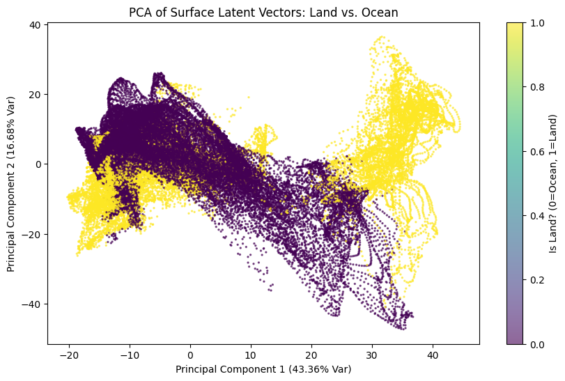
The separation between land and ocean is evident in the PCA space, with yellow points representing land and purple points representing ocean. Although these points partially overlap, they also tend to organise into distinct spatial regions. Oceans are primarily located in the left and central areas of the plot, corresponding to low to moderate values of PC1, while land points are concentrated toward high positive values of PC1, showing a wide dispersion along PC2.
This indicates a clear but not perfect separation, as the two clusters are not entirely disjoint. The visible trajectories suggest an underlying temporal or spatial organization, and the curved shapes of the points imply that the latent variables are constrained by different physical regimes over land and sea.
The overlap indicates that some oceanic regions share characteristics with land, such as coastal zones or enclosed seas, and vice versa. Overall, the PCA reveals a marked separation between the latent vectors of land and ocean, with high explained variance, showing that the latent space effectively encodes this physical distinction, even though intermediate zones exist.
Logistic Regression (Land-Sea)
We next apply logistic regression to predict whether a patch corresponds to land or ocean, using the latent vectors as input. This tests directly whether the encoder has encoded the land–sea boundary.
For evaluation, we split the globe into training and testing regions. All patches between longitudes 120° and 210° (covering much of Australia and East Asia) form the test set, giving roughly a 75/25 split.
After classification, we can also map the errors back onto the globe to see where the regression fails, highlighting regions where the encoder’s representation of land–sea differences is less distinct.
from sklearn.linear_model import LogisticRegression
from sklearn.metrics import accuracy_score

def run_logistic_regression(train_split_dict: dict) -> dict:
    clf = LogisticRegression(max_iter=1000)
    clf.fit(train_split_dict["X_train"], train_split_dict["y_train"])
    y_pred = clf.predict(train_split_dict["X_test"])
    return {
        "model": clf,
        "y_pred": y_pred,
        "acc": accuracy_score(train_split_dict["y_test"], y_pred),
    }

test_lon_min = 120.0
test_lon_max = 210.0

train_split_dict = get_train_test_split(
    test_lon_min,
    test_lon_max,
    patch_center_lon,
    land_sea_mask_patched.ravel(),
    surf_embedding,
)

reg_res = run_logistic_regression(train_split_dict)
Running the regression gives an accuracy of 99.87%, a clear indication that the encoder has internalised the land–sea distinction. Still, this result comes from a single run and a relatively simple task, so it should be interpreted cautiously.
To dig deeper, we can examine the misclassified patches to see where the model struggles to maintain this separation.
# Get the locations of the errors
is_misclassified = (reg_res["y_pred"] != train_split_dict["y_test"])

error_lons = region_center_lons[is_misclassified]
error_lats = region_center_lats[is_misclassified]

# Plot them
plot_dots_on_map(
    error_lons, error_lats,
    color="black", s=50, alpha=0.7,
    extent=[-150, 90, -90, 90],
)
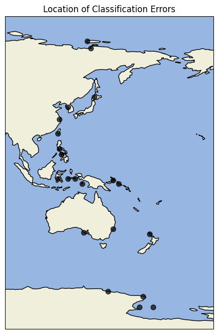
Most errors occur along coastlines, where the land–sea distinction is inherently less clear. This is an encouraging result, as the encoder not only separates land from ocean but also reflects the natural uncertainty present at boundaries.
Extreme Temperature
We now turn to how the encoder captures representations of extreme values, using the same methodology as before (PCA combined with logistic regression).
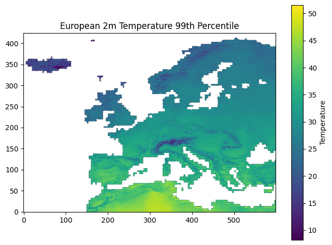
Our focus will be on the 2-metre temperature variable, which is part of the surface variable set. For this analysis, an extreme value is defined as one exceeding a specified percentile threshold. Percentiles are sourced from ECMWF’s Temperature statistics for Europe derived from climate projections dataset, which provides 30-year percentile estimates for 2-metre temperature across the European region. We specifically use the maximum percentile values.
Since this dataset is restricted to Europe, our analysis will also be limited to this region. We are also obtaining values for the 75th, 90th, 95th and 99th percentiles.
The dataset can be accessed programmatically with the CDS API (a CDS account is required). Below is a short example of how to download the data:
dataset = "sis-temperature-statistics"
request = {
    "variable": "maximum_temperature",
    "period": "year",
    "statistic": [
        "75th_percentile",
        "90th_percentile",
        "95th_percentile",
        "99th_percentile"
    ],
    "experiment": ["rcp4_5"],
    "ensemble_statistic": ["ensemble_members_average"]
}

client = cdsapi.Client()
client.retrieve(dataset, request, target="temperature_percentiles")

# Unzip data
zip_file_path = 'temperature_percentiles'
with zipfile.ZipFile(zip_file_path, 'r') as zip_ref:
    zip_ref.extractall('/content/extracted_data')

# Extract maximums
percentile_year = "2020-01-01"
percentiles = [75, 90, 95, 99]
percentile_data = {
    f"p{p}": (
        xr.open_dataset(f"extracted_data/p{p}_Tmax_Yearly_rcp45_mean_v1.0.nc")
        .sel(time=percentile_year)[f"p{p}_Tmax_Yearly"]
    )
    for p in percentiles
}
One of the first steps with the percentile arrays is to resample them to match the resolution of the patch embeddings, using the patch centres calculated earlier.
Since the percentile data only covers the European land region, it is also useful to construct a mask aligned with the patch embedding grid ($180 \times 360$). This mask identifies the locations where valid percentile values are available.
# Lat/lon bounds
patch_lat_bounds = np.stack([patch_center_lat - 0.5, patch_center_lat + 0.5], axis=-1)
patch_lon_bounds = np.stack([patch_center_lon - 0.5, patch_center_lon + 0.5], axis=-1)

# Reduce the percentiles into the patches
patch_level_percentiles = {
    p: reduce_percentiles(p_data, patch_lat_bounds, patch_lon_bounds)
    for p, p_data in percentile_data.items()
}
# There are many nans, only keep valid values
# Each percentile has the same nans so just use p99's
is_valid_percentile = ~np.isnan(patch_level_percentiles["p99"])
With the percentile data in place, the next step is to obtain the actual temperature fields to embed with the encoder. To ensure that values exceed the chosen percentile thresholds, we select periods corresponding to heatwave events.
After identifying the relevant dates, we extract the corresponding fields from the ERA5 dataset and pass them through the encoder. The selected samples are then stacked together, resulting in a dataset of 10 encoded instances.
heatwave_dates = [
    "2022-07-14T12:00", "2022-07-14T18:00", "2022-07-28T12:00",
    "2022-07-28T18:00", "2022-07-19T12:00", "2022-07-19T18:00",
    "2019-06-28T12:00", "2019-06-28T18:00", "2019-06-29T12:00",
    "2019-06-29T18:00",
]

X = []
for heatwave_date in heatwave_dates:
    # Prepare initial conditions
    ic_end = np.datetime64(heatwave_date)
    ic_start = np.datetime64(ic_end) - np.timedelta64(1, "6h")
    ic = era5_ds.sel(time=slice(ic_start, ic_end))

    # Get encoder output
    heatwave_batch = get_aurora_data(ic, static)
    full_embedding = run_encoder(aurora_model, heatwave_batch)

    # Reshape and extract
    reshaped_embedding = full_embedding.reshape(1, 4, 64800, 512).squeeze()
    surf_embedding = reshaped_embedding[0].transpose(1, 0)
    X.append(surf_embedding[:, is_valid_percentile.ravel()])

X = np.stack(X).transpose(1, 0, 2).reshape(512, -1)
Next, we construct the binary labels. For each percentile, we define a mask that assigns a value of 1 whenever the ERA5 temperature at a given longitude–latitude location exceeds the corresponding percentile threshold, and 0 otherwise. This process is repeated for all percentiles under consideration.
Since we have 4 different percentiles (75th, 90th, 95th, and 99th), we obtain 4 different arrays. Each of which can be used as the y-labels in separate logistic regressions.
# Construct regression labels
temp_2m = era5_ds["2m_temperature"].sel(time=heatwave_dates)
temp_2m = temp_2m.assign_coords(longitude=((temp_2m.longitude % 360) - 180))

is_extreme_all_p = {}
for p, patch_level_percentile in patch_level_percentiles.items():
    is_extreme_all_p[p] = []
    for i, temp_2m_values in enumerate(temp_2m.values):
        temp_2m_patched = reduce_field(temp_2m_values, patch_size=4) - 273.15
        is_extreme = temp_2m_patched[is_valid_percentile] > patch_level_percentile[is_valid_percentile]
        is_extreme_all_p[p].append(is_extreme)

    is_extreme_all_p[p] = np.stack(is_extreme_all_p[p]).ravel()
PCA (Extreme Temperatures)
We then apply PCA with two components. Here, there is only a single input dataset, since the encoder representations of the heatwave events are fixed. What changes across experiments are the percentile-based labels.
For classification, we run a separate logistic regression for each percentile. For the PCA visualisation, however, we construct a multi-label array. Because percentiles are nested (e.g., values above the 99th percentile are by definition also above the 95th and lower percentiles), this approach captures the hierarchical structure of the labels.
This setup enables us to examine not only whether PCA reveals structure for a given percentile, but also whether progressive changes in structure emerge as the percentile threshold increases.
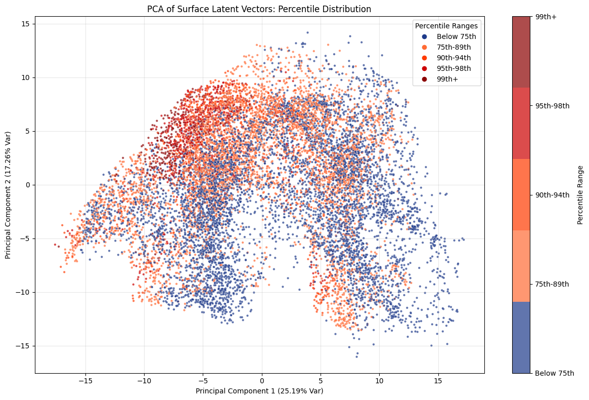
This PCA plot highlights how latent representations capture the progression from moderate to extreme values in a structured way. While lower percentile cases scatter broadly across the space, the more extreme percentiles gradually converge toward a distinct cluster in the upper left region of the plot.
This gradient suggests that the principal components encode an underlying axis of intensity, where increasingly rare and severe events occupy a well-defined subspace rather than appearing randomly distributed. In other words, the PCA not only reduces dimensionality but also reveals that extremity itself is a coherent feature of the latent structure, offering insight into how extremes are systematically organised within the dataset.
PCA (Extreme Temperature)
Now we’ll perform logistic regression on each of the percentile labels separately.
# Run logistic regression separately for all percentiles
percentile_regs = {}
percentile_splits = {}
for p, y in is_extreme_all_p.items():
    X_train, X_test, y_train, y_test = train_test_split(
        X.T, y,
        test_size=0.2,
        stratify=y,
    )

    train_test_split_dict = {
        "X_train": X_train,
        "y_train": y_train,
        "X_test": X_test,
        "y_test": y_test,
    }
    percentile_splits[p] = train_test_split_dict
    percentile_regs[p] = run_logistic_regression(train_test_split_dict)
It is important to note that the labels are highly imbalanced. For instance, at the 99th percentile, only about 2.8% of samples correspond to an extreme event. In such cases, relying on accuracy alone can be misleading, so we also evaluate precision and recall.
-
Precision measures how reliable the model is when it flags an extreme event. High precision means that when the model predicts “extreme,” it is very likely correct.
-
Recall measures how many extreme events the model successfully captures. High recall means the model misses very few true extreme events.
The table below summarises accuracy, precision, and recall across different percentiles:
| Percentile | Accuracy | Precision | Recall |
|---|---|---|---|
| p75 | 0.929888 | 0.925097 | 0.938871 |
| p90 | 0.968750 | 0.935135 | 0.865000 |
| p95 | 0.975962 | 0.896907 | 0.813084 |
| p99 | 0.991587 | 0.916667 | 0.774648 |
For moderate extremes such as the 75th and 90th percentiles, the model achieves both high accuracy and balanced precision–recall, meaning it can reliably identify these events without producing many false alarms.
However, as we move into the tail of the distribution, particularly beyond the 95th and 99th percentiles, recall drops sharply even while precision remains high. This pattern suggests that the model is very conservative in labeling extremes: when it does predict an event as extreme, it is usually correct, but it increasingly misses a large share of the rarest cases.
Given the imbalance in the dataset, with far fewer examples at the upper percentiles, this behavior is expected, but it also underscores a critical limitation—while the model avoids overestimating extremes, it underestimates their true frequency.
Conclusion
Our exploration shows that the encoder captures meaningful structure in the latent space, both in terms of geography and extremes. The PCA and regression analysis confirm that the encoder has learned to distinguish land from ocean, achieving nearly perfect accuracy, with most errors concentrated along coastlines where the boundary is naturally ambiguous. This indicates that the model reflects not only clear-cut distinctions but also the inherent uncertainty of physical boundaries.
Extending this approach to extreme temperature events, we see that the nested percentile labels reveal how the encoder represents increasing levels of extremity. Precision and recall metrics highlight the trade-offs between correctly identifying rare extremes and missing them, underscoring the need to look beyond accuracy when dealing with imbalanced datasets.
Together, these results suggest that the encoder is learning representations aligned with real-world structure while also exposing where limitations remain. Such insights are valuable for assessing the robustness of learned climate representations and for guiding further model development.